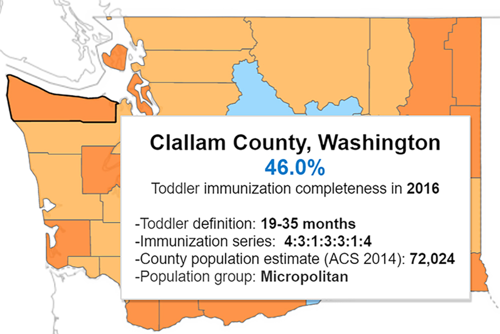
A new data visualization dashboard from the Public Health Activities and Services Tracking (PHAST) team enables health departments and researchers to compare toddler immunization completeness data across counties and states.
As outbreaks of vaccine-preventable diseases make headlines, public health practitioners strive to meet the Healthy People 2020 goal to “increase immunization rates and reduce preventable infectious diseases.” To accomplish this, health departments and researchers need immunization data that aren’t always available, or which may lack crucial context and details. State-level data can hide how immunization rates differ between counties, or whether toddlers in those counties—who are too young to be reflected in school immunization data—are getting fully immunized.
Now, a University of Washington team has designed a solution: a new, user-friendly data visualization dashboard of county-level toddler immunization completeness. Led by NWCPHP Director Betty Bekemeier, PhD, MPH, RN, FAAN, and funded by the Robert Wood Johnson Foundation, the Public Health Activities and Services Tracking (PHAST) team worked with public health leaders, data scientists, researchers, epidemiologists, and immunization experts to design, test, and refine the dashboard.
Partners from around the country responded to PHAST’s call for data, helping PHAST populate the dashboard with several years of data from 14 states: Florida, Indiana, Iowa, Kansas, Kentucky, Maine, Minnesota, New Mexico, New York, Oregon, Tennessee, Utah, Washington, and Wisconsin. PHAST hopes this number will grow as more states share comparable data.
“Public health leaders, practitioners and researchers are identifying a wide array of uses for this dashboard,” said Bekemeier. With the dashboard’s maps, graphs, and other data visualization tools, users can compare counties’ immunization completeness percentages to those of other counties, the state median, or the Healthy People 2020 goal of 80 percent. They can also compare rates between some states and see how immunization completeness has changed over time.
These visual comparisons raise helpful questions for practitioners and researchers to explore further, such as why rates have improved in one county but not in another, or why rates in a county began to improve and then declined. State and county officials can compare rates with those of neighboring or similar geographic locations to set achievable goals and assess their progress. County-level detail helps leaders identify locales that may be at a higher risk for outbreaks, or where deeper interventions and more resources may be needed.

Users can download visualizations to share with colleagues, health officers, policymakers, and other leaders. Beyond the dashboard, users may find broader applications for the data, including comparing immunization rates with external sources of information, such as a specific state’s legal requirements for immunization completeness in day-care settings.
However, the dashboard highlights problems and gaps not just with immunization completeness—but also with data collection, availability, and comparability. Because states lack standardized measures for immunization completeness, it’s hard to make apples-to-apples comparisons between their data. Advocating for such standardized measures is a core principle of PHAST’s Measures project, from which the dashboard was developed.
For example, although 22 states shared data with PHAST, over one third of those data sources were not comparable with those of other states, and could not be included. Moreover, states define “toddler” using different age ranges, so even within the dashboard, each state can only be compared with other states that use the same age range.
With the dashboard’s initial launch complete, PHAST is working to increase its use, encourage states to share more data, and generate momentum for uniform data collection. As states change how they collect and share data, the team hopes the dashboard will make clear why standardized, comparable, and visualized data are so valuable for making decisions.
